Dashboard and Onboarding
Introduction
Dooly helps revenue teams win more deals by improving CRM hygiene, and sales processes while eliminating low-value work.
I owned and strategized the product dashboard and onboarding redesigns to be more understandable, valuable, and delightful.
My roles
Generative/evaluative research, content strategy, design system, UX/UI, 5-day sprint participant, and illustration.
Outcomes
Speed to value has increased drastically — users are adopting features and using them 40% faster than before these updates. This has heightened the value of Dooly for customers and created a much faster adoption period for leads trying out Dooly for the first time.
The problem
Several users reported that the first impression of the dashboard is confusing, overwhelming, difficult to navigate, and not valuable. In fact, we received an email from a new user who was so overwhelmed that they left the app.
Through my observations on FullStory, I noticed that many users exhibit similar behavior, such as aimlessly clicking around and rage-clicking before ultimately exiting the app. These experiences highlighted the need for a more user-friendly design.
Five-day design sprint
My product manager and I decided to run a 5-day sprint with our squad and several stakeholders.
Monday: Affinity map ideas using research and stakeholder feedback
Tuesday: Sketch competing solutions
Wednesday: Present and vote on the best sketch
Thursday: Build a realistic prototype
Friday: Prototype test with realistic customers
Problem statement
Dooly's current navigational hierarchy has too much secondary content with equal weight given to all paths of navigation. This creates competing sub-feature level navigational patterns, which can make completing tasks difficult and unpredictable for inexperienced users. This overreliance on other productivity and revenue management tools like Salesforce signals that we need to focus more on our own product value.
Our new focus was to shift the platform to a journey-driven information architecture that is intuitively discoverable for all new users that come to Dooly and flatten the breadth and depth of the IA, streamlining the left nav into a central main nav, and re-imagining the “workspace hub” as the starting place for all product journeys.
User testing
I built a greyscale prototype and drafted a moderated usability test plan to gather insights on the concept through a working prototype.
Dooly did not have a research function, so I led all research efforts with help from Mya.
Key design sprint takeaways
Centralizing relevant content on the dashboard homepage improves early core feature adoption.
Migrating to global navigation is more familiar and intuitive for users.
By divorcing language from Salesforce patterns, users will understand Dooly’s value faster.
Onboarding workflow
We focused on understanding the specific needs and goals of Dooly's users, including business development reps, account executives, sales leaders, and revenue operations. Our goal was to tailor the dashboard to better support these users by learning about their goals and designing the dashboard with those goals in mind.
Information architecture
We implemented a journey-driven information architecture that I had conceptualized earlier. The previous navigation was a disorganized list of buttons without any clear structure.
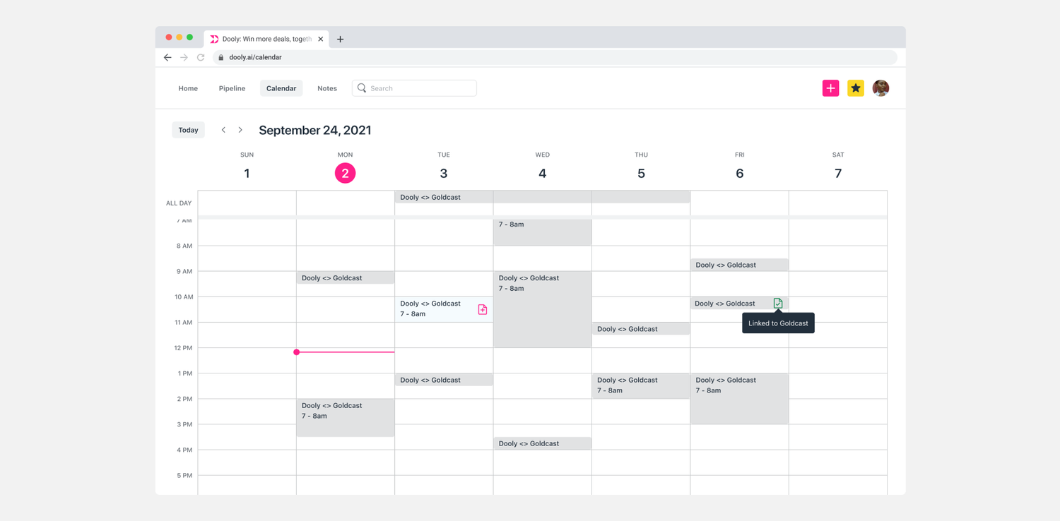
I redesigned the navigation to be more simplified and based on the natural progression of the “journey” customers take within Dooly. I organized it into primary navigation actions, search, and global actions. I renamed "Unlinked Notes" to just "Notes" and placed Templates and Playbooks within the Notes page as they are both related to creating and organizing notes. I also changed "Meetings" to "Calendar" to better reflect its function and to address user requests.
In addition, I grouped Quick Create, Favorites, and Profile together as global actions that can be accessed from anywhere within the app and removed them from the proximity of the search and the primary navigation buttons. This helps to streamline the navigation and make it more intuitive for users.
Custom illustrations
I created new product illustrations that seamlessly incorporate the marketing brand and add a touch of visual appeal. It was crucial to ensure that the illustrations accurately depicted a diverse range of skin tones, in order to promote inclusivity and representativeness.
Outcomes
Speed to value has increased drastically — users are adopting features and using them 40% faster than before these updates. This has heightened the value of Dooly for customers and created a much faster adoption period for leads trying out Dooly for the first time.


