Marketing website & design system
Introduction
The Hologram marketing website needed a complete overhaul. The information architecture was outdated, the platform had too many limitations, the branding was outdated, and prospects were confused by its content.
As a product designer on the growth squad, I owned onboarding and new user experiences within the product dashboard. The Director of Product Design asked me to own the redesign of the marketing website and “productize” the design process. He wanted me to lead the research, design system creation, and partner with the brand team on redesigning the website.
My roles
Generative and evaluative research, content strategy, design system, UX/UI, iconography, and illustration.
Timeline
6 months
Outcomes
The successful launch of the new website has brought Hologram a substantial increase in hard commitments, resulting in a significant boost in the number of qualified leads being generated. This development has played a critical role in our company's growth and underscores the effectiveness of our strategic approach.
Diligent efforts have yielded noteworthy enhancements across a multitude of crucial data points. Notably, we have achieved substantial improvements in performance, accessibility, SEO, time to the first interaction, and several other key metrics.


Discovery research
I established our key goal was to gather perceptions of where top friction points and misinformations are for leads and prospects when attempting to accomplish a task on the marketing website.
I interviewed over 12 stakeholders and customers and conducted 6 card sort exercises with IoT professionals in order to better understand how they group common IoT information on websites.
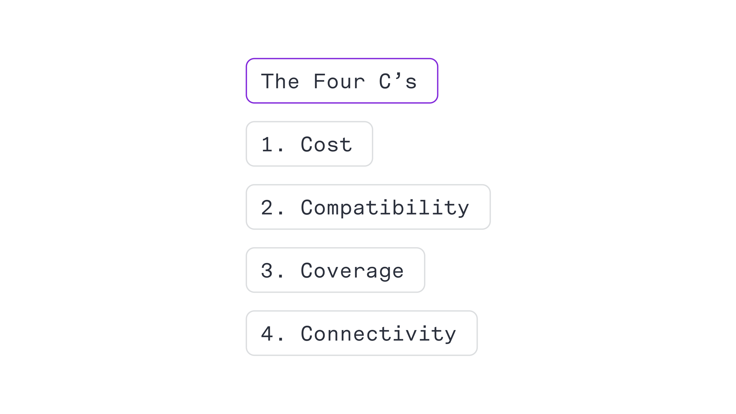
Key research takeaways: The 4 C’s
I conducted research and analysis to identify the critical factors that potential clients need to consider when selecting a connectivity platform. I discovered that clients need to know about cost, connectivity, coverage, and compatibility, which I referred to as "The Four C's." This framework has been universally adopted by our company to provide prospects with comprehensive information, enabling them to make informed decisions about selecting Hologram as their connectivity platform.

Heuristic analysis
I conducted a heuristic analysis using the Jack Nielsen ten usability heuristics framework. Hologram scored the worst on the total severity rating. The site had nine out of ten usability heuristic issues.

Big changes and challenges
Following four weeks of conducting user interviews and designing components, a significant layoff event took place, which affected both my Brand Designer and Product Manager, leaving me with a doubled workload. Despite the obstacles, I adapted by revisiting prior plans and research and made crucial adjustments. In addition, I took on the responsibility of product strategy and brand-related tasks such as defining brand direction and creating illustrations.

Information architecture
The restructured IA was informed by card sorting and user interviews, revealing that IoT professionals group Hologram's technology and organize use cases by industry and customer story.

Design library audit
The previous website had multiple content blocks that were either redundant, difficult to navigate, or unnecessary. I carefully identified and documented all blocks that needed to be either removed or reworked for improved usability.

Design system
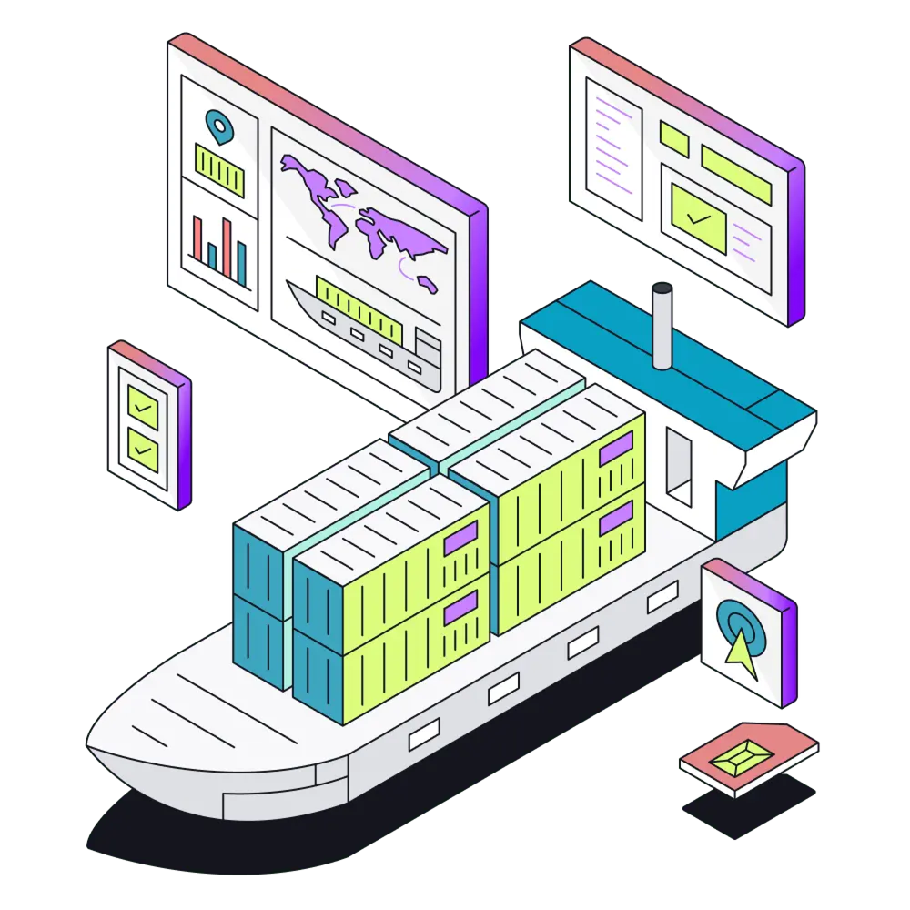
I designed a comprehensive collection of over 30 unique components, each with multiple variants and representations for tablet and mobile devices. Additionally, I crafted a set of dozens of visually engaging pictograms for intuitive navigation. To enhance the user experience, I created over 15 stunning custom illustrations.
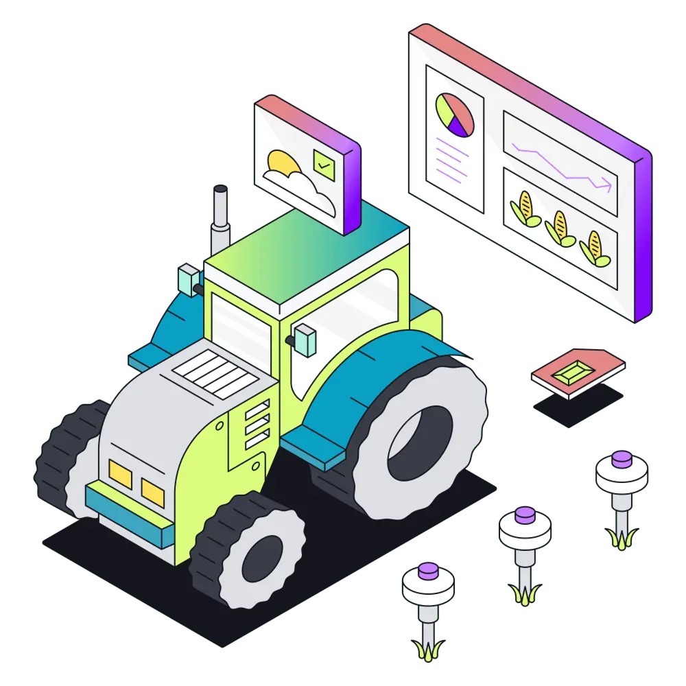
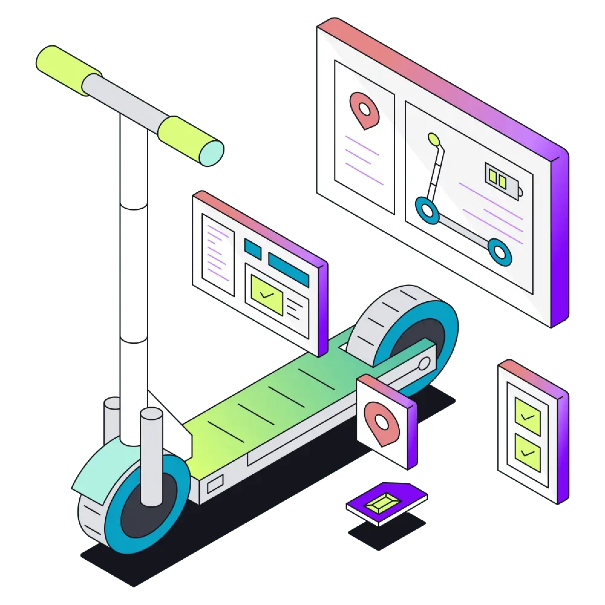
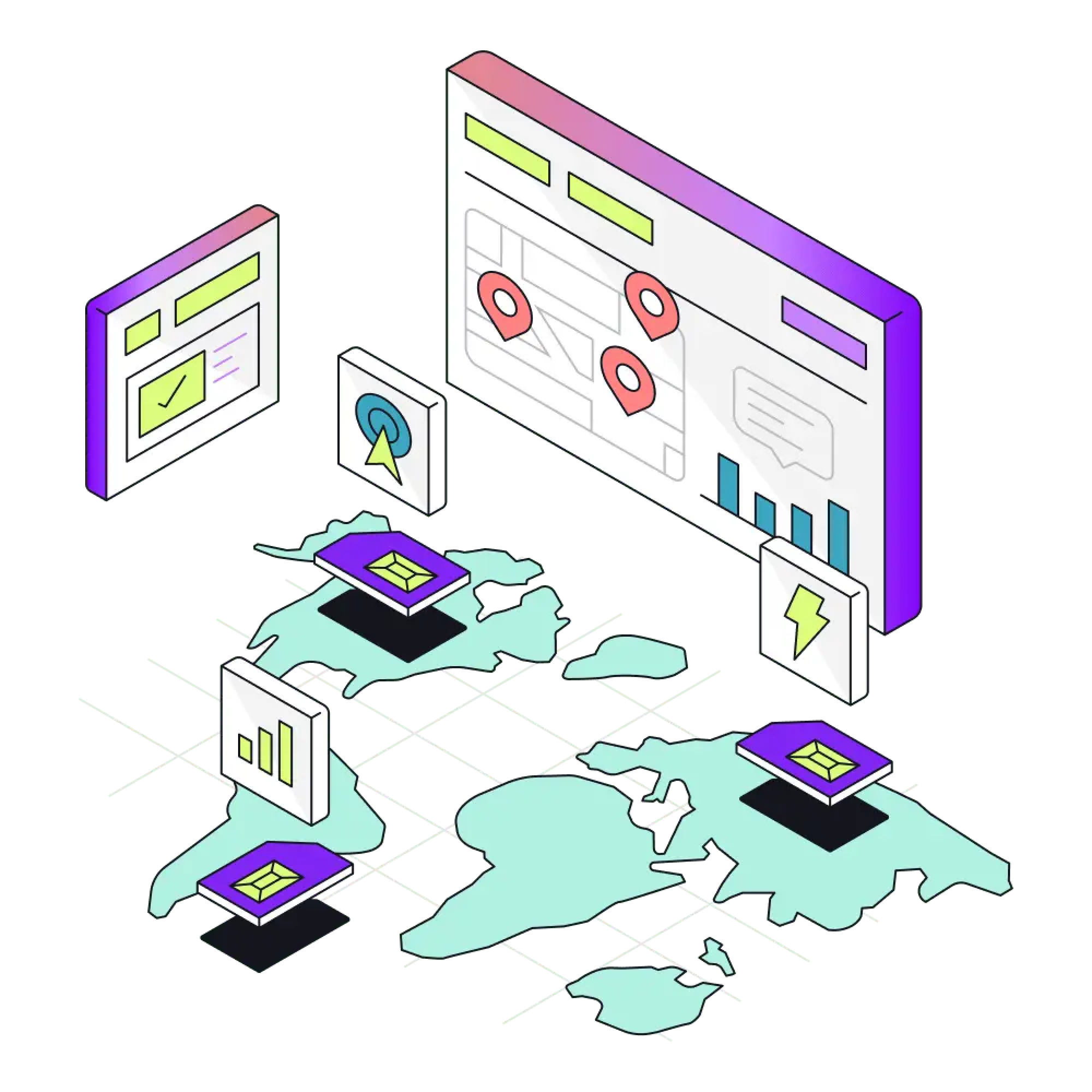
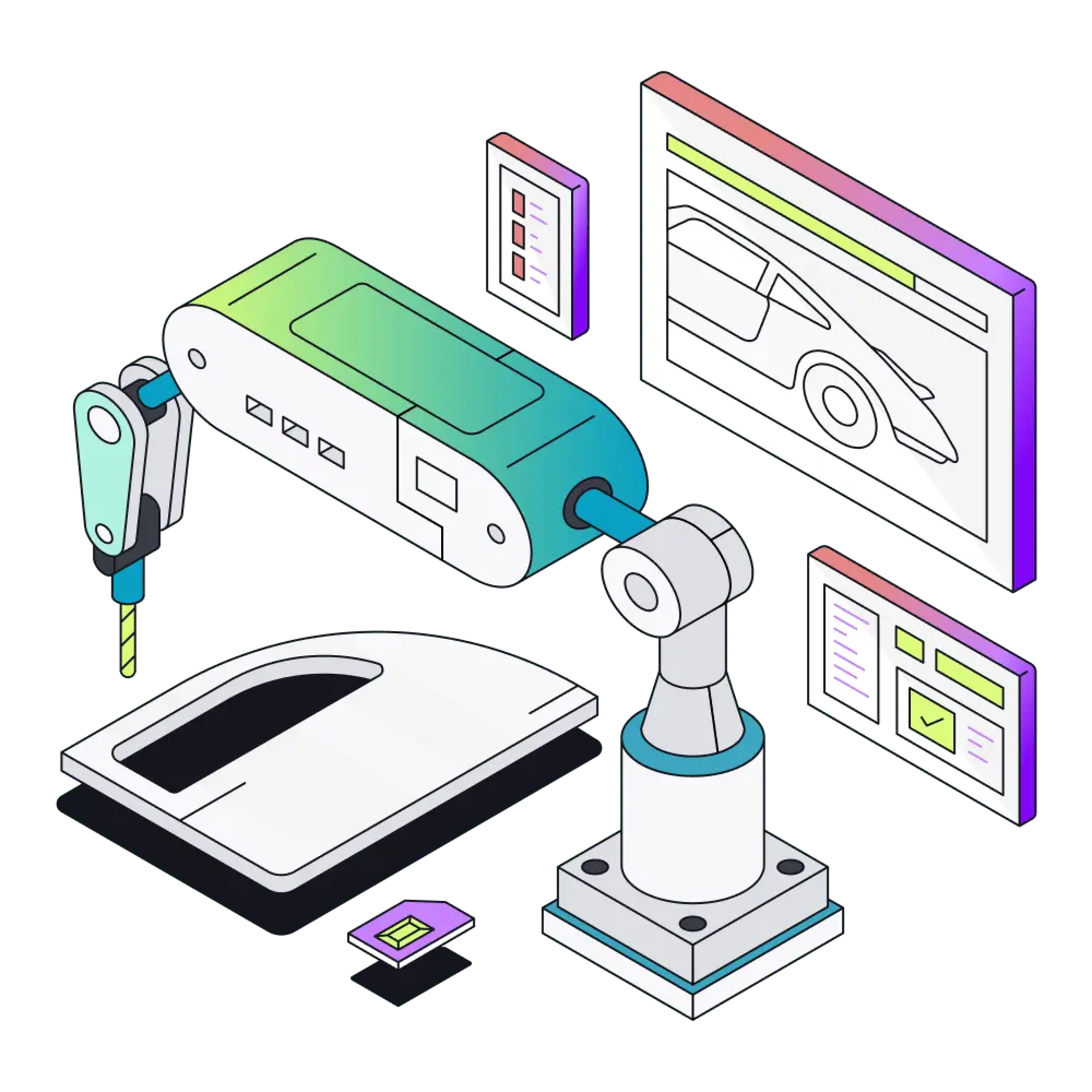
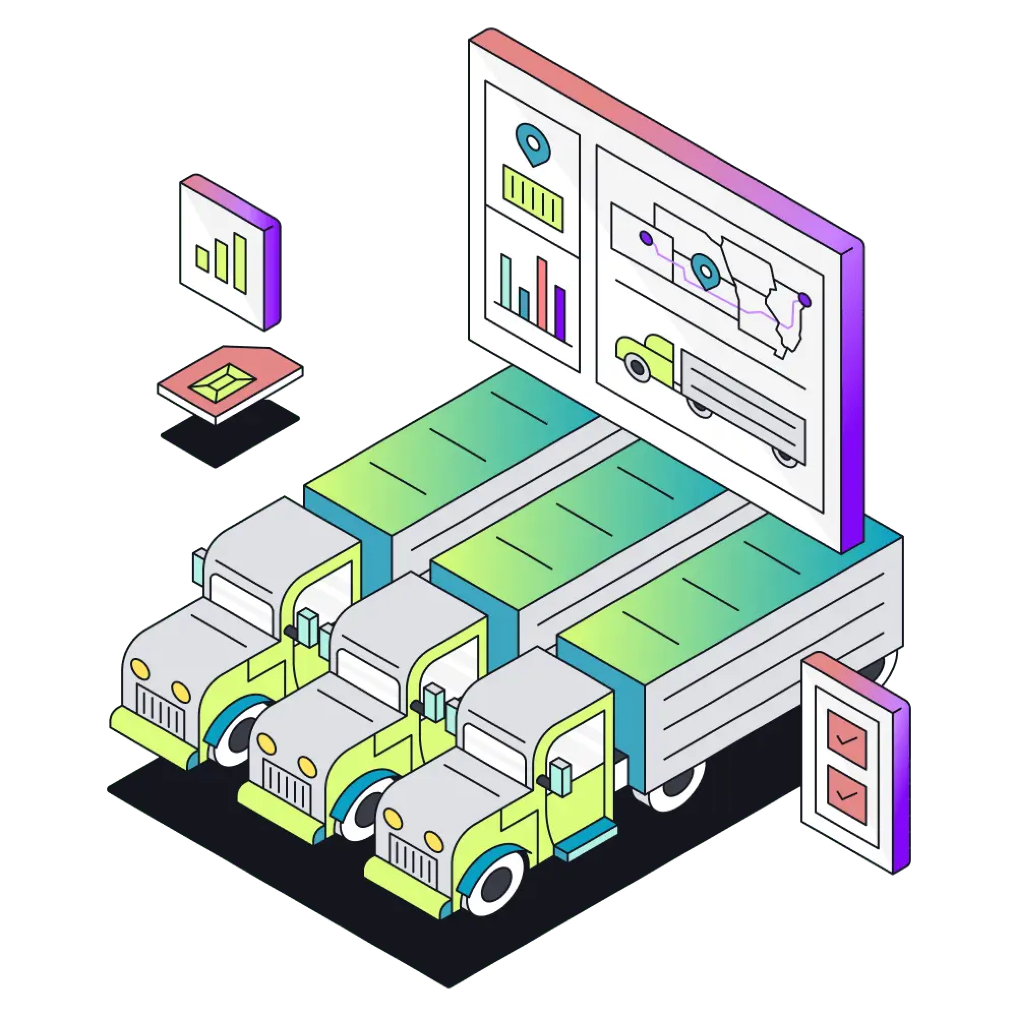
Illustrations
I designed dozens of illustrations and pictograms that not only elevate the website's aesthetic appeal but also strengthen its brand identity. These elements are strategically placed throughout the site to ensure a seamless user experience that leaves a lasting impression on visitors.

Pricing page optimization
The pricing page for V1 presented some room for improvement. It failed to showcase Hologram's three new plans, features, and support, while only displaying self-service rates. However, with dedicated efforts from our product, design, engineering, and leadership teams, we developed a concept that is better suited to our prospect's requirements. The new pricing page offers clear communication of rates, volume discounts, features, and support, all presented through a mobile-optimized UI.

Pricing page outcomes
Not only has the pricing page bounce rate dropped significantly, but there have also been many more significantly positive outcomes:
Form completions have increased by 16%
Store purchases have DOUBLED
Dashboard signups have increased by 64.71%

Outcomes
The successful launch of the new website has brought Hologram a substantial increase in hard commitments, resulting in a significant boost in the number of qualified leads being generated. This development has played a critical role in our company's growth and underscores the effectiveness of our strategic approach.

Outcomes
Diligent efforts have yielded noteworthy enhancements across a multitude of crucial data points. Notably, we have achieved substantial improvements in performance, accessibility, SEO, time to the first interaction, and several other key metrics.