Realtime Receipt
Introduction
Ibotta is a cash back rewards app available on both iOS and Android platforms and used by over 6 million MAU. However, the app faced a significant problem - the core cashback feature, which involved the user uploading their receipt, had a confusing user flow. Specifically, users were not informed of the critical receipt elements that needed to be captured, including the retailer, date, time, and total amount. This communication gap led to frustration and difficulties in the cashback process.
My goal was to create a simple and informative experience using real-time edge detection and optical character recognition so users stop missing out on cash and churning.
My roles
Product design, evaluative research, content strategy, prototyping, iconography, IxD, and mobile viewport design.
Timeline
4 weeks
Outcomes
Today, the receipt upload feature has reduced improper receipt photos by a whopping 30% for over 6 million monthly active users.
There has also been a 10% reduction in receipt captures per user due to the camera viewport optimization. This outcome taught me that seemingly small changes can have drastic impacts on a feature’s usability and that considering every change within scope is better than just focusing on the project requirements.


Discovery
I discovered in my initial research that we had never interviewed users to hear in their own words about the receipt upload experience. So I partnered with our squad researcher to create a research plan to interview users. Our goal was to understand users’ cash back expectations, observe how they upload their receipts, and dig into their understanding of what information is needed when capturing a receipt.

Workshop
I planned and facilitated a workshop with cross-functional participants from product, iOS and Android development teams, and key stakeholders. My goal was to gather a comprehensive understanding of the business needs and technical limitations of the receipt upload experience.
One area of opportunity found during my workshop was to expand the camera viewport height in order to reduce the number of photos users need to take. So I removed the black bar that was on the existing screen and floated the take photo button on top of the viewport — this expanded the screen height by 10%.

Heuristic analysis
I performed a heuristic analysis of Ibotta’s receipt upload experience. I observed how or if the UI communicated system status, user control placements, UI standards, and much more.
I also conducted several competitive audits to understand how similar challenges were solved within the same industry.
The biggest challenge of this project was the need to reduce friction while adding more UI, plus the fact that thousands of users were churning each month with Ibotta’s core feature.

Explorations
I found more opportunities in the receipt upload instruction screen. I noticed during my user interviews that users would automatically dismiss the receipt upload instruction screen that prompted every time the receipt upload flow started. Users had formed banner blindness to the screen, but I also knew that the instructions were important for new users who might not know what to do with the receipt upload feature.
My solution was to only prompt instructions for first-time users and also provide access to instructions within the user flow. This would reduce friction and banner blindness for new and existing users, while not sacrificing access to the instructions for people who need them.

Shipped version
Creating the appropriate messaging and alert level would be critical to the success of this core feature. If users felt a constant sense of failure when a receipt edge was not found, the experience would be nerve-racking and that only could cause churn. But the messaging needed to be obvious enough while communicating the importance of capturing the receipt edges, date, time, and total.
I achieved this balance by prompting the right visuals and messaging, at the right time.
When a receipt edge is not found, it is communicated gracefully and delightfully, rather than creating panic or a sense of failure.
Outcomes
Today, the receipt upload feature has reduced improper receipt photos by a whopping 30% for over 6 million monthly active users.
There has also been a 10% reduction in receipt captures per user due to the camera viewport optimization. This outcome taught me that seemingly small changes can have drastic impacts on a feature’s usability and that considering every change within scope is better than just focusing on the project requirements.
Barcode Scanners
Introduction
Over 80% of Ibotta’s six million monthly active users depend on in-store product purchases to get cash back through the app. This means the products they purchase need to match cash back offers within the app.
My roles
Product design, evaluative research, prototyping, IxD, and mobile viewport design.
Timeline
1 week
Outcomes
The updates streamlined the user experience and makes it easier for Ibotta engineers to work on the codebase. As a result, millions of Ibotta users can now easily earn cash back with minimal effort. Our updates have not only benefited our users but also made it more efficient for our team to continue improving the platform.

Problems
The problems with this core feature were inconsistency, bugs, accessibility, and usability.
The inconsistencies created redundant mental models for users, little room for screen content, and a complicated code base for engineers. In fact, after speaking with my squad engineers I learned that each barcode scan screen required its own class in the code base.

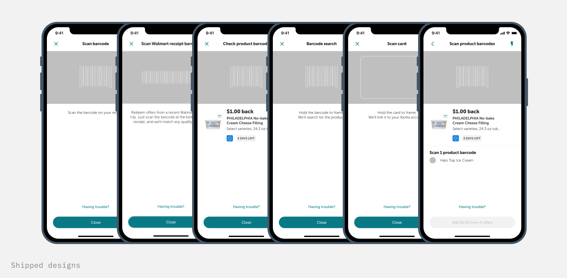
UI structure
There are six scanners needed within the Ibotta app:
Verify within receipt upload scanner
Verify within search
Walmart receipt barcode scanner
Loyalty card scanner
Submit issue barcode scanner
Add products to offer list scanner
My goal was to design a structure that could be used across all six scanners. This would reduce user mental models and create a much simpler scanner code base. Since each scanner is prompted by a specific action, there was no confusion about which scanner the user was on.

Outcomes
The updates streamlined the user experience and makes it easier for Ibotta engineers to work on the codebase. As a result, millions of Ibotta users can now easily earn cash back with minimal effort. Our updates have not only benefited our users but also made it more efficient for our team to continue improving the platform.